

Hyperoptic - Order to Activation journey
During my tenure at Hyperoptic, I led a critical project to enhance the Order to Activation (OTA) journey. Recognizing the need for a more streamlined and user-friendly process, I led a redesign to address user pain points and improve the overall customer experience.
This case study outlines my approach, including mapping customer journeys, identifying information gaps, and designing an improved user interface.
Project overview:
Role:
Lead UI/UX designer
Objective:
Improve the Order to Activation journey for Hyperoptic customers, making it more efficient and user-friendly.
Tools Used:
Figma, Usabilla, Hotjar, Microsoft Teams, Creately
Project Summary:
The goal was to enhance the OTA process by addressing user feedback and creating a more intuitive experience.

Problem Statement
The existing Order to Activation process at Hyperoptic was plagued with inefficiencies and user frustrations. Common issues included slow activation times, lack of clear communication, and difficulty navigating the activation steps.
These issues led to customer dissatisfaction and increased cancellation rates. Improving this journey was essential to enhance customer satisfaction and retention.

Some of the feedback of Hyperoptic customers from the MyAccount survey
My Approach
Given our research on MyAccount, we had the data and user feedback identifying the problems. This project focused on executing and fixing the OTA journey, identified through three key steps:
Mapping Customer Journeys
Identifying Information Gaps
Designing an Improved User Experience
1. Mapping Customer Journeys
Objective:
Understand all pathways customers take from placing an order to activating their service
Approach:
Organized sessions with different teams and stakeholders to gather all the necessary steps customers need to follow to activate their service.
Created and updated user flows for each customer group, ensuring we addressed the unique needs of every type of customer in the activation journey.

We identified four main customer groups (A, B, C, D), each with unique activation pathways.
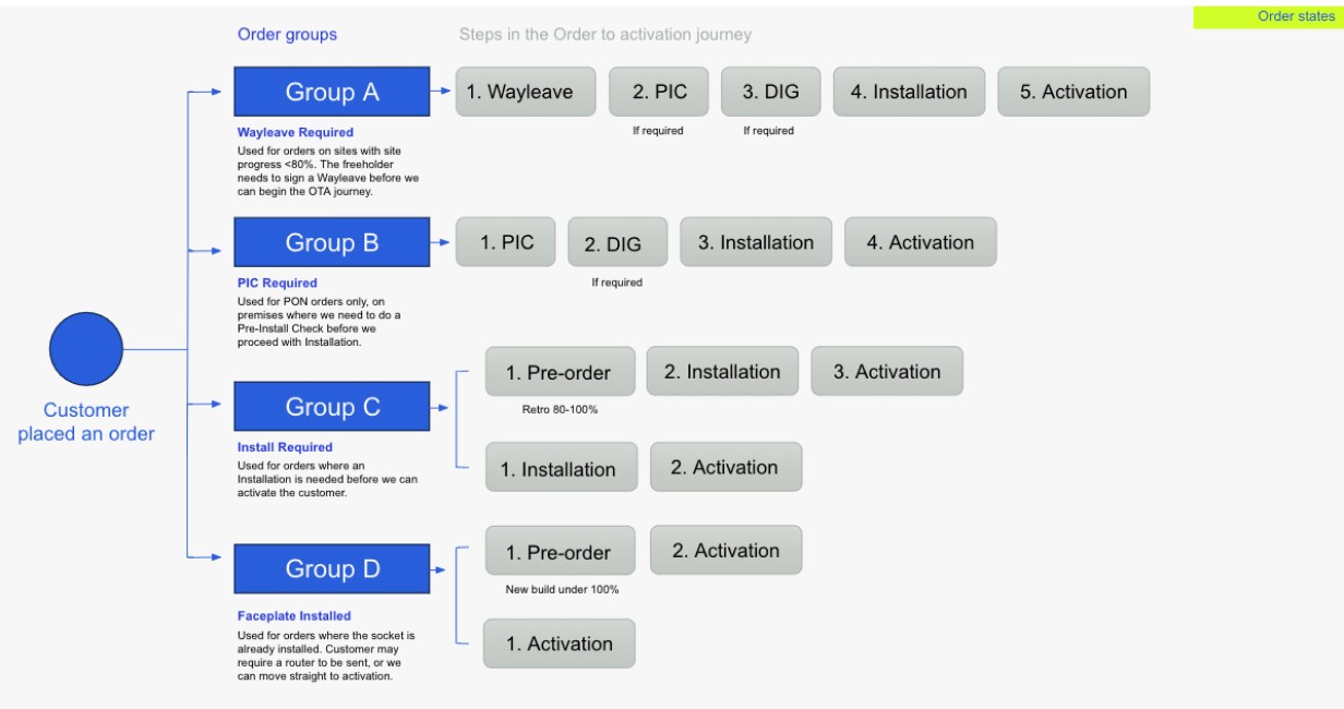
Capturing the complexity of different customer journeys was challenging, where activation times ranged from minutes (Group D) to over 30 days (Group A) due to additional steps like wayleave signing, pre-install checks, and installations.

Activation for Group A
2.Identifying Information Gaps
Objective: Analyze current MyAccount pages to identify where information was lacking.
Pinpointed specific sections needing improvement to provide clearer guidance and information.

Screenshot of the old design
We discovered that all customers saw the same generic progress bar, lacking personalized steps or clear indications of their current stage.
3. Designing an Improved User Experience
Objective:
Create an intuitive interface guiding users seamlessly through their activation journey.
Actions:
Developed user-friendly designs with customized screens for each customer group.
Incorporated clear visual steps, icons, and progress indicators.
Collaborated closely with copywriters to craft clear, actionable messages for each step.
Screenshots of the new design in MyAccount dashboard - showcasing clear visual steps:


3. Key Improvements
Customized Steps:
Created tailored activation steps for each customer group, replacing the generic three-step process.

Slide from the Survey presentation to the stakeholders
Visual Progress Indicators:
Added icons and green checkmarks for each step to help customers quickly identify their current stage and see completed tasks.

Green checkmarks to showcase progression in steps
Informative Tooltips:
Introduced tooltip icons for future steps, allowing customers to understand upcoming actions in their journey.


Conclusion
This project was a significant learning experience, enhancing my skills in customer journey mapping and complex problem-solving. By:
Collaborating with various teams (customer service, engineers) to understand unique processes.
Designing over 30 custom screens with tailored messages.
Addressing all possible scenarios to provide clear, actionable steps for users.
We successfully created a more user-centric OTA journey. The project underscored the importance of thorough research, clear communication, and collaborative effort in delivering exceptional user experiences.
I am particularly proud of the extensive research and numerous sessions with various teams, including customer service and engineers, to understand and address each group's unique processes. This project underscored the importance of thorough research, clear communication, and collaborative effort in creating a user-centric platform.
Overall, this project not only enhanced my research and design skills but also reinforced the value of a collaborative, user-focused approach to problem-solving. It was a fitting culmination of my time at Hyperoptic, leaving a positive impact on the user experience and the organization's processes.
What's next?
Want to see how I tackled another big challenge at Hyperoptic?
Explore my work on user research, pain point identification, and design enhancements in my other Hyperoptic project.
VIEW STUDY
Or are you more interested
in my latest work
Check out how I helped launch a real estate platform from scratch at my current company RGG.
VIEW STUDY
2024 Dejan Velimirovic. All right reserved.