

Improving UX for a leading UK broadband provider Hyperoptic
In more than two years working as a full-time UI/UX designer at Hyperoptic, I had the opportunity to work on many exciting projects. However, this project was particularly important as it significantly contributed to my growth as a designer and sparked several other exciting initiatives.
Project overview:
Role:
Lead UI/UX design at Hyperoptic.
Tools Used:
Usabilla, Creately, Hotjar, Microsoft Teams, ChatGPT, Figma
Objective:
Improve the MyAccount user experience based on user feedback and data analysis.
Key Goals:
Identify pain points through user surveys and testing.
Enhance usability and design of the MyAccount pages.
Implement changes to increase user satisfaction and engagement.
Problem Statement
Regular reviews of customer feedback revealed numerous negative comments about the MyAccount section. Users reported:
Functionality issues
Slow performance
Poor user experience
Inaccurate information in different journeys
Missing features
These issues led to frustration, abandoned interactions, and a negative brand perception, indicating a pressing need for comprehensive improvements.
To address these issues, I led a comprehensive user research initiative, designing and conducting detailed surveys to gather insights on user behavior, preferences, and pain points.
Leveraging these insights, we formulated actionable improvements to enhance the functionality and satisfaction of the MyAccount pages.
1. Research & Survey
The survey was designed to include a mix of quantitative and qualitative questions and was distributed to a broad user base through email and website prompts. Tools like Usabilla, ChatGPT and Hotjar were used to facilitate this process.
Survey Goals:
Understand user behavior and preferences.
Identify specific pain points in the MyAccount pages.
Gather user suggestions for improvements.

Focus Areas:
Frequency of MyAccount visits
Tasks performed
Importance and availability of features
Ease of navigation and challenges faced
Overall satisfaction and device preferences
2. Survey results
The survey was conducted over a period of more than one month, from June 7th to August 2nd.
Survey Details:
Total Views: 36,754
Total Completed Surveys: 1,347
Conversion Rate: 4%
We kept the survey open longer due to a steady flow of valuable responses, especially to the open-ended questions.

Slide from the Survey presentation to the stakeholders
Key Points
High Engagement: The significant number of responses indicated strong user engagement and a willingness to share feedback.
Consistency Across Devices: The conversion rates were consistent across mobile and desktop, suggesting a uniform user experience issue across platforms.
Rich Qualitative Data: The open-ended questions gave detailed user feedback, which was crucial for identifying specific pain points and areas for improvement.
3. Analysis & Findings
I analyzed survey data to identify common themes and patterns. The responses were categorized into five key areas, each highlighting different aspects of the user experience.

3.1 Usage and device preference

Majority access MyAccount via mobile devices. Prioritize mobile optimization and ensure consistency across devices.
3.2 Functionalities
Users frequently mentioned specific features they used within MyAccount, such as billing information, service status, and support ticketing.

These key features should be prominently accessible and user-friendly. Enhancements in these areas could significantly improve user satisfaction.
The survey also highlighted that users were looking for more specific features and functionalities within the MyAccount section.
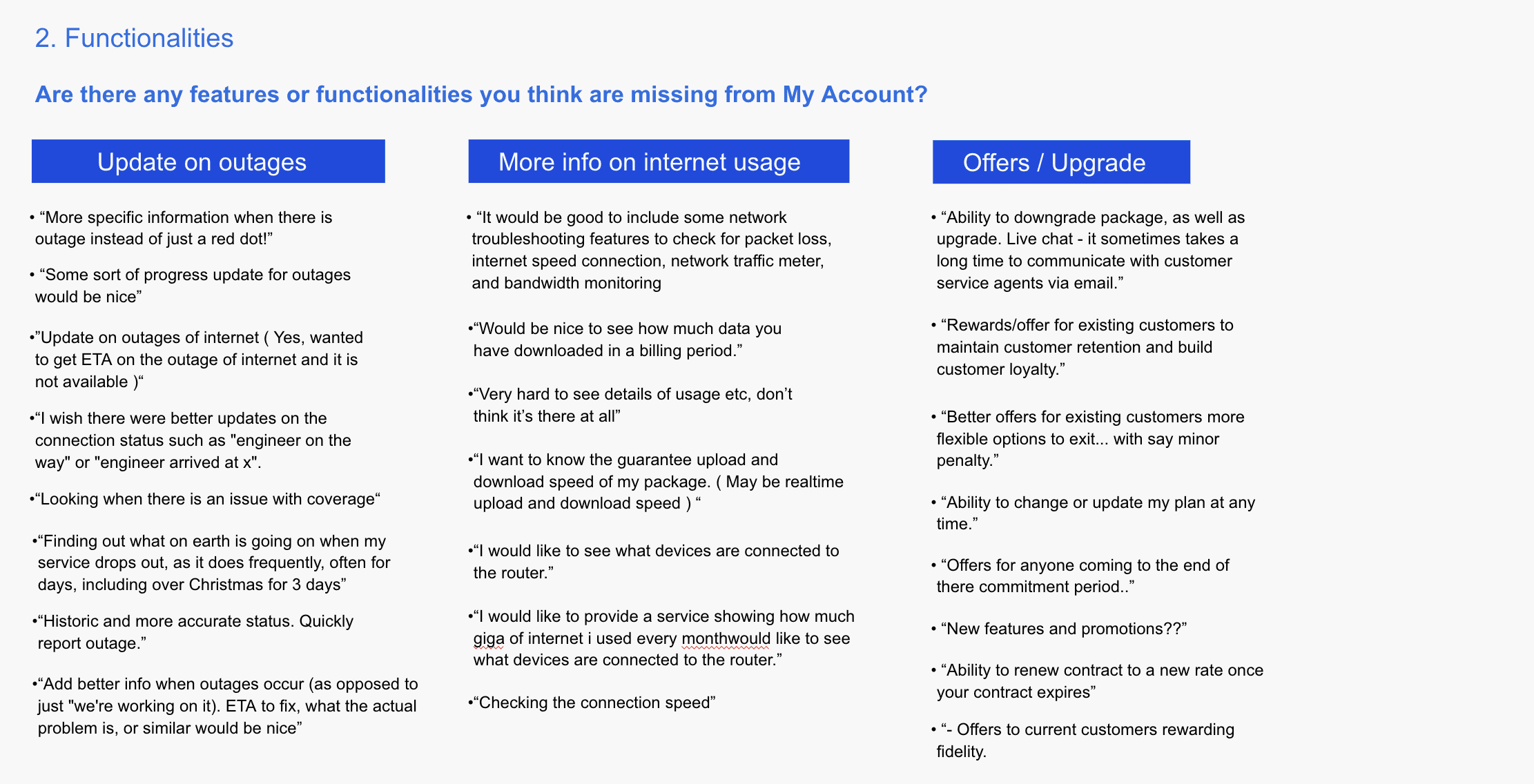
Some of the feedback included the need for better updates on outages, option to change router settings, more detailed information on internet usage, ability to manage offers and upgrades directly through MyAccount.
Missing Features:
Updates on outages
Detailed internet usage information
Options for offers/upgrades
Router password changes
Delivery information
3.3 Demand for a Mobile App

3.4 Speed & navigation
Slow Load Times: Users experienced delays when loading pages, leading to frustration.
Complex Navigation: The navigation structure was unintuitive, making it hard for users to find what they needed.

3.5 Order to Activation Journey
One of the most significant findings from the survey was the issues users faced in the order to activation journey. Many users reported difficulties in understanding the process, delays, and lack of clear communication.
Lack of Clarity: Users found the order to activation process unclear, leading to confusion.
Delays: There were significant delays in activation, causing frustration among users.
Communication Gaps: Users felt that communication during the activation process was inadequate.

Slide from the Survey presentation listing some of the negative feedback about OTA
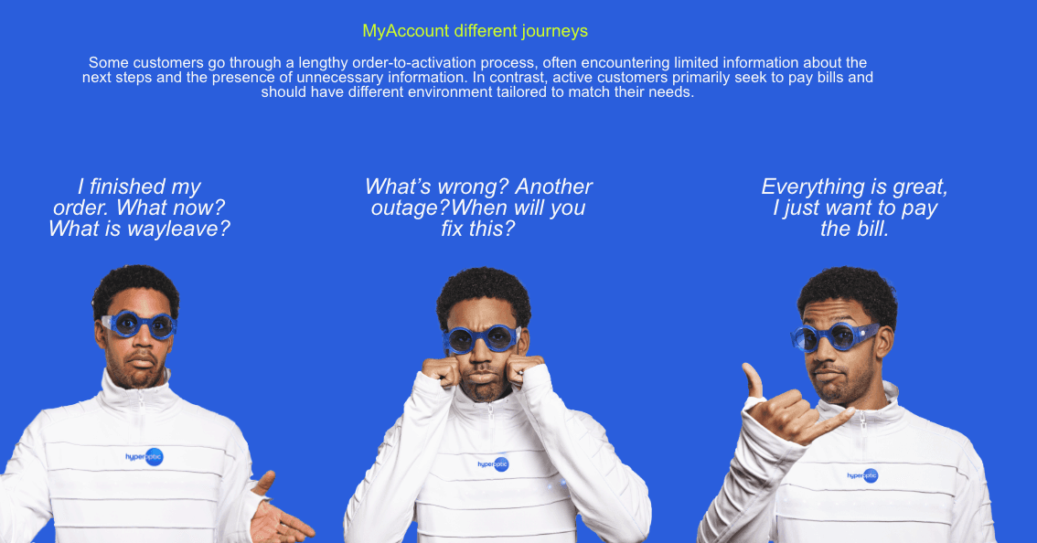
Slide from the Survey presentation to the stakeholders - showcasing different types of journeys in MyAccount
Users face confusion, delays, and poor communication during the activation process.
4. Summary of Key Actions
Based on the insights gathered from the survey, we identified several key areas for improvement and outlined specific actions to address these issues:
1. Enhance Mobile Experience
Action: Optimize MyAccount for mobile devices to meet the preferences of the majority of users.
2. Improve Core Functionalities
Action: Make essential features easily accessible and incorporate missing functionalities like outage updates and internet usage details.
3. Explore Mobile App Development
Action: Conduct further research on user needs for a mobile app and plan accordingly.
4. Optimize Speed and Navigation
Action: Address performance issues and redesign navigation for intuitiveness and efficiency.
5. Revamp Order to Activation Journey
Action: Initiate a dedicated project to improve this critical user journey (detailed in a separate case study).
5. Results & Impact
The research provided invaluable insights into the user experience of the MyAccount section. By collecting both quantitative and qualitative data, we were able to identify key pain points and areas for improvement.
This comprehensive approach aligned our design and development efforts with the actual needs and preferences of our users, paving the way for a more user-centric MyAccount experience.
Which led to actionable insights that directly influenced several key projects:
Project 1: Router (Equipment) Tracking
Implementation: Added a feature in MyAccount for users to track equipment delivery.

This feature provided clear and concise information at every step of the delivery process.
Project 2: Activate Your Service
Implementation: Enabled users to activate their service independently through a streamlined three-step process.

Project 3: SSID Password Change
Provided functionality for users to change router settings, including SSID and password. Which directly reduced customer service calls and improved user empowerment
Project 4: Order to Activation Journey Improvement
Launched a comprehensive project to overhaul the activation process (explained further in the
next case study where we addressed major user frustrations, improving overall user experience.
6. Conclusion
This project significantly enhanced the MyAccount user experience by addressing critical pain points identified through thorough research. By prioritizing user needs and leveraging data-driven insights, we:
Improved user satisfaction and engagement.
Streamlined key user journeys and functionalities.
Fostered a user-centric culture within the organization.
This project was a significant learning experience. I improved my skills in conducting user research, data analysis, and translating insights into actionable design improvements.
One of the major challenges was balancing the extensive data analysis with ongoing design and implementation tasks. However, I had great support from my manager and other stakeholders as they found this research very important.
Stakeholders were very engaged during my presentations, asking insightful questions and expressing enthusiasm for the actionable key points, which we later implemented into team roadmaps.
Overall, the project underscored the importance of user research in guiding UX design and highlighted our commitment to creating a user-centric platform.
This experience has not only enhanced my research and design skills but also reaffirmed the value of a collaborative, user-focused approach to problem-solving.
What's next?
Order to Activation Journey Improvement
If you're curious about how I improved the Order to Activation journey, dive into the details of my next project.
VIEW STUDY
Discover MyHouz Project

VIEW STUDY
2024 Dejan Velimirovic. All right reserved.