
MyHouz - Real Estate Platform
As a Senior UI/UX Designer at Rapid Global Growth (RGG), I led the design of MyHouz—a user-centric real estate platform offering users the ability to buy homes in USA with licensed agent assistance and a 1% cashback on the purchase price.
Project overview:
Role:
Senior UI/UX Designer (end-to-end responsibility from research to implementation)
Duration:
January – March 2024 (2+ months)
Tools Used:
Figma, ChatGPT, Fullstory, Userlytics, Asana, Slack, Unbounce
Objective:
Redesign the MVP to enhance user engagement and conversions by creating a user-friendly platform highlighting the 1% cashback offer.
Key Results:
200% Increase in Average Session Duration
40% Increase in User Engagement
10x Increase in Soft Conversions (user bookings)


Problem Statement
The initial MVP, built on a generic template, lacked personalization and an effective user interface, resulting in poor engagement and low lead conversion.
I was leading end-to-end design responsibilities to transform the MVP into a high-performing platform. My key responsibilities included:
1.Research
Conducted competitive analysis of 15+ real estate websites to understand the market.
2.Wireframes
Developed low and high-fidelity wireframes in Figma for both desktop and mobile.
3.Design
Created a comprehensive design system in Figma.
Designed all website pages focusing on user-centered design principles.
4.Collaboration
Worked with cross-functional teams ( CRO, QA, Dev & Other ) using agile workflows.
Supported implementation, conducted user testing, and iterated designs accordingly.
1. Research
Explored industry leaders like Redfin and Zillow to identify strengths in UI/UX and user engagement strategies.
Key Insights:
Identified critical user journey pages: homepage, listing page, property detail page.
Emphasized the need for effective property showcases with multiple viewing options.
Prioritized efficient search and filtering systems.
Recognized the importance of mobile optimization.


2. Wireframes
I created wireframes in Figma, starting with very low-fidelity to gather initial feedback from stakeholders. These initial wireframes were crucial for aligning with stakeholders' expectations and incorporating their inputs early in the design process.

1. Low-Fidelity Wireframes
Created basic layouts to establish structure and gather stakeholder feedback quickly.

2. High-Fidelity Wireframes
Refined designs with detailed elements for accurate representation.

3. Desktop & Mobile Views
Optimized wireframes for both desktop and mobile to ensure a seamless user experience.
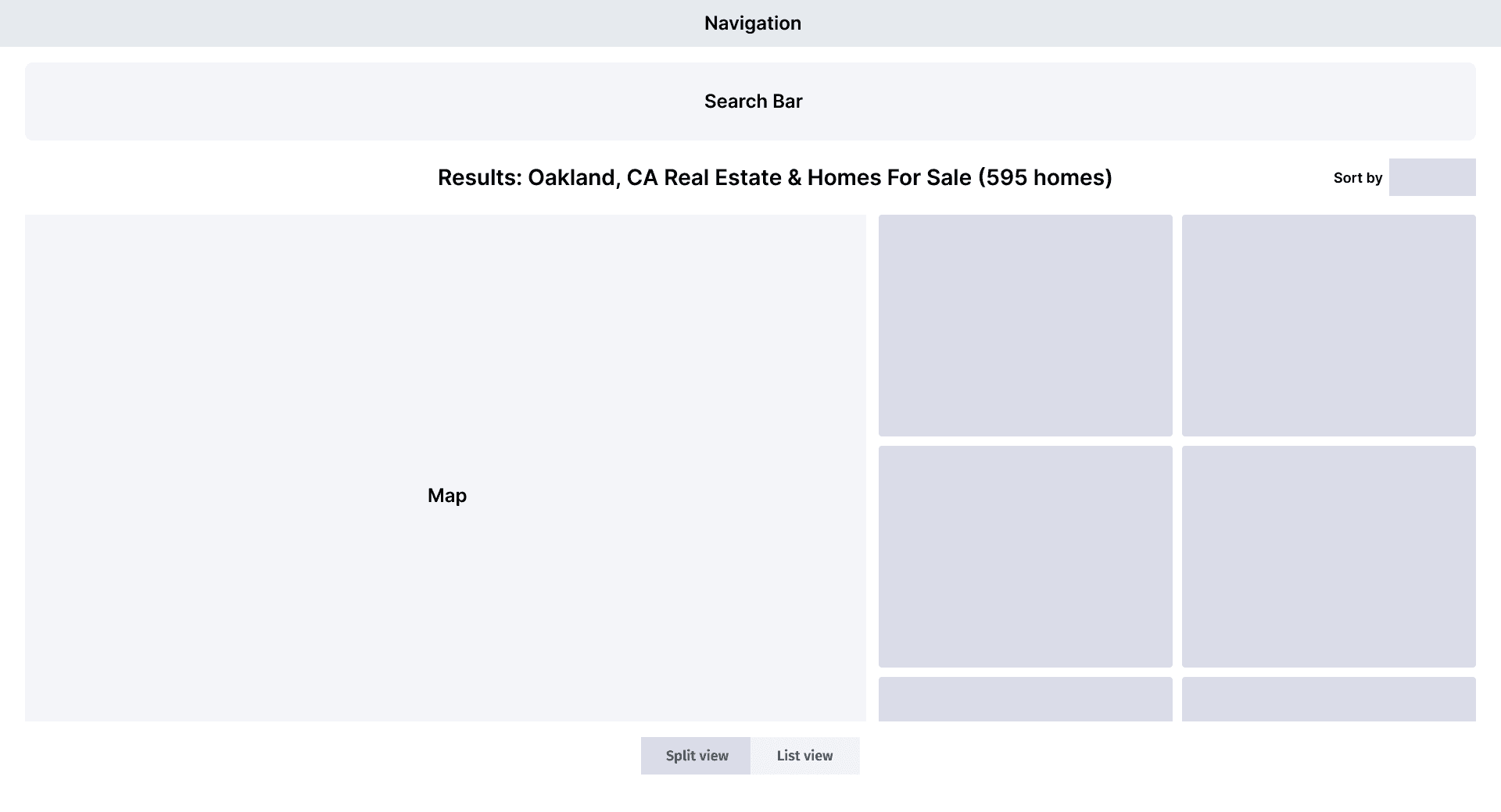
Listing page
Explored options like map and list views, ultimately providing users with control over property viewing methods.

Property Detail Page
Exploring different layouts in the low-fidelity wireframe phase was crucial for optimizing user experience on the Property Detail Page.


After analysis, we chose the final layout where the property information and key CTAs are placed clearly above the fold. This decision was based on ensuring users have immediate access to critical information and actions, enhancing the overall usability and effectiveness of the page.

3. Design
User-Centered Design: Prioritizing the needs and preferences of users by incorporating feedback from initial wireframes and iterating on the design based on usability testing.
Consistency: Maintained a unified design language across all pages and devices.
Simplicity: Simplified interfaces for easy navigation and information retrieval.
Color Scheme:
Used blues, greens, and neutrals to evoke trust and reliability.
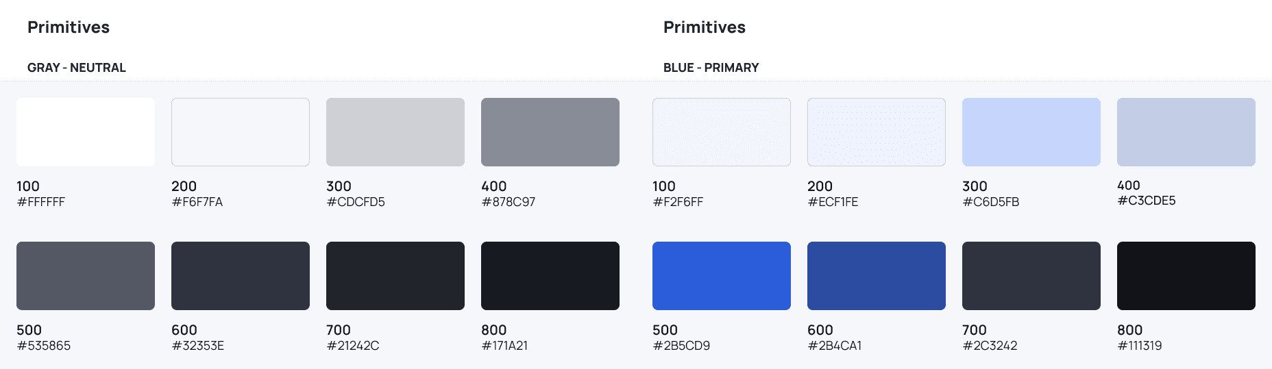
Typography:
Selected Manrope font for its readability and modern appearance.

Key Design Elements:
Cashback USP
Communicating the unique selling proposition (USP) of 1% cashback was crucial for MyHouz. We needed to ensure users understood this benefit across the entire platform.
Initially, a small banner was placed below the navigation to communicate the 1% cashback offer. However, user testing revealed that this information was often missed by users.
Revised Strategy: By integrating the 1% cashback information into key areas of the platform, we ensured that users were consistently informed about this important benefit.
Added cashback details on property cards with tooltips.
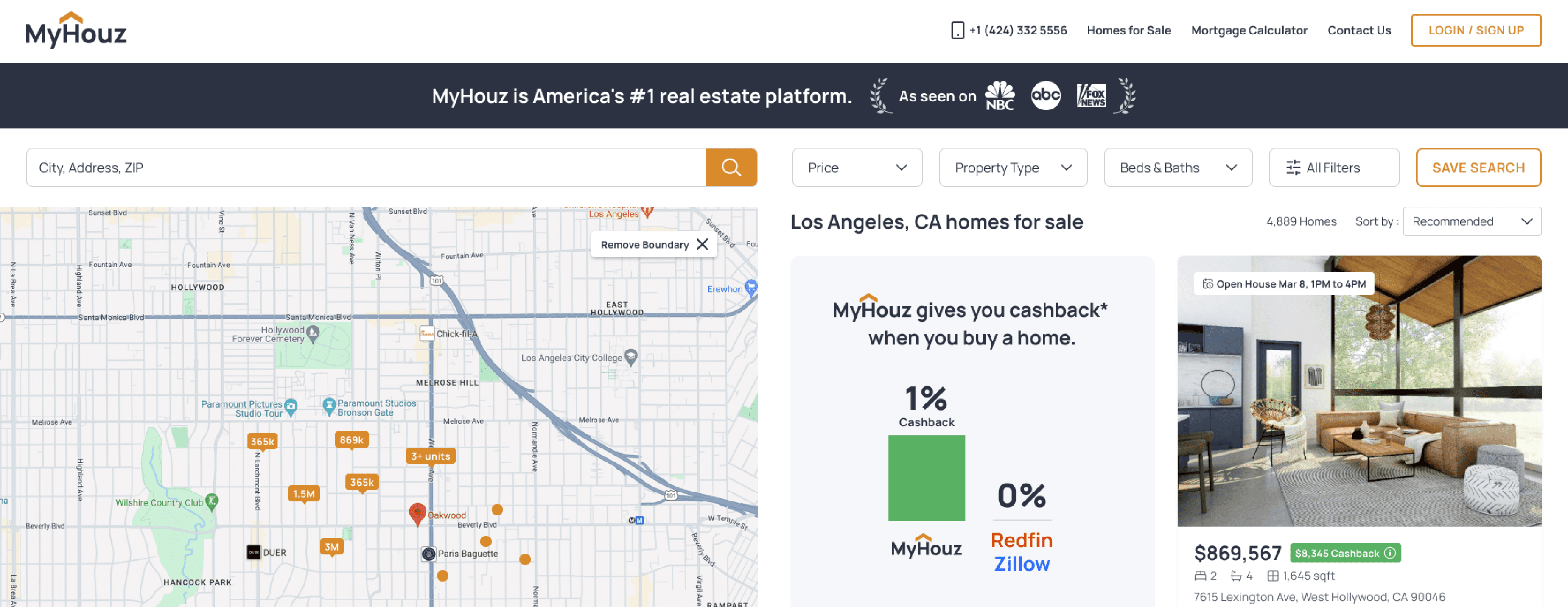
Included cashback info next to CTAs and property prices.

Created a large comparison table to highlight the 1% cashback USP against competitors.


Search and Filters
Ensuring that users could easily access and utilize search filters was a key priority for the user experience. Additionally, we introduced an "All Filters" button, allowing users to open a sidebar with a comprehensive set of filters for more detailed and refined searches.


Responsive
I designed mobile-specific layouts for the search and filters to ensure that users could easily navigate and access essential functionalities on smaller screens.


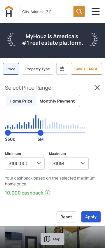

This approach ensured that users had quick access to essential filters and the option for more detailed filtering.
4. Design System
Built a cohesive design system in Figma, defining visual elements such as color palettes, typography, iconography, and components.
Foundation:
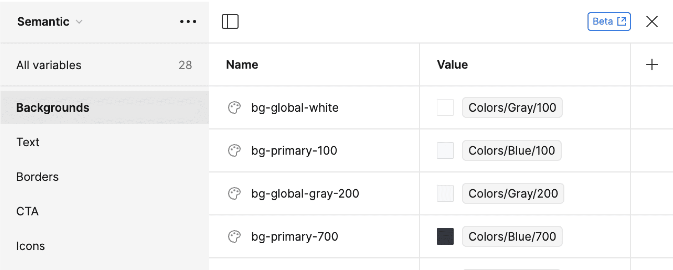

Components
Followed Atomic Design principles for scalability and consistency.
Standardized buttons, input fields, and search bars
5. Implementation & Collaboration
Agile Workflow: Short sprints with daily stand-ups for alignment.
Communication: Used Slack for updates and Asana for task management.
Documentation: Provided detailed design specs in Figma and held collaborative workshops.
Quality Assurance: Worked closely with QA to ensure accurate implementation.
Challenges and Achievements:
1. Responsive Design Adjustments:
Challenge: Ensuring a seamless experience across various devices.
Achievement: Implemented a responsive design that maintained usability and appeal on all platforms.
2. Consistency Across Teams:
Challenge: Aligning different teams with the design system.
Achievement: Conducted workshops and training sessions, fostering a collaborative environment and a unified user experience.
3. Usability Testing:
Conducted over 10 usability tests with Userlytics.
Analyzed user behavior with FullStory to inform iterative design improvements.
6. Key Metrics and Outcomes
The redesign of MyHouz got significant improvements in user engagement and platform performance. Key metrics that highlight these achievements include:
200%
Increase in Average Session Duration
Users spent more time engaging with the platform.
40%
Increase in User Engagement
Doubled our initial goal, indicating higher interaction rates.
10x
Increase in soft
conversions
Significant rise in users scheduling bookings within the first month.
Conclusion
The success of the MyHouz redesign demonstrates the profound impact that strategic UI/UX design can have on a digital product. Despite tight deadlines and the complexities of an agile workflow, we achieved a cohesive and engaging platform that resonates with users.
The significant boosts in engagement and conversions are a direct result of our user-centered approach and diligent collaboration across teams. This project exemplifies how combining design innovation with practical execution leads to outstanding results.
What's next?
Improving MyAccount at Hyperoptic:
Explore my work on user research, pain point identification, and design enhancements in my other Hyperoptic project.


VIEW STUDY
Enhancing the Order to Activation Journey:
Check out how I improved the Order to Activation journey, diving into customer experiences.
VIEW STUDY
2024 Dejan Velimirovic. All right reserved.