Elevating Revenue and User Engagement at Puffy: A Redesign that Amplified RPV by 17%
As a Senior UI/UX Designer at Puffy.com - a rapidly growing luxury mattress brand achieving annual revenues between $50 and $100 million - I led a redesign of the product comparison page, significantly improving user experience and boosting conversion rates.
Project overview:
I identified a crucial opportunity to enhance the user experience on our mid-page (MP) product comparison page. This page allows users to compare Puffy's four main mattresses and plays a vital role in the customer decision-making process.
Role:
Senior UI/UX Designer
Duration:
Oct – Nov 2024
Tools Used:
Figma, ChatGPT, FullStory, Userlytics, Asana, Slack
Objective:
Elevate the user’s perception of product quality and luxury by redesigning the comparison page to feature larger, full-screen displays with premium imagery. This approach aimed to improve product visibility, simplify the comparison process, and drive higher user engagement and conversions.
Key Results:
(Further detailed results and insights are discussed later in the study.)
Check out the live redesigned page: View the Live Comparison Page


Problem Statement
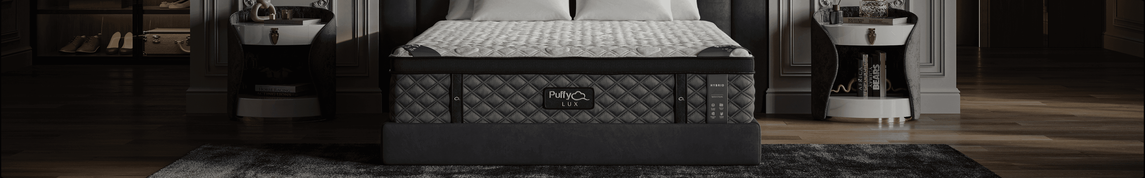
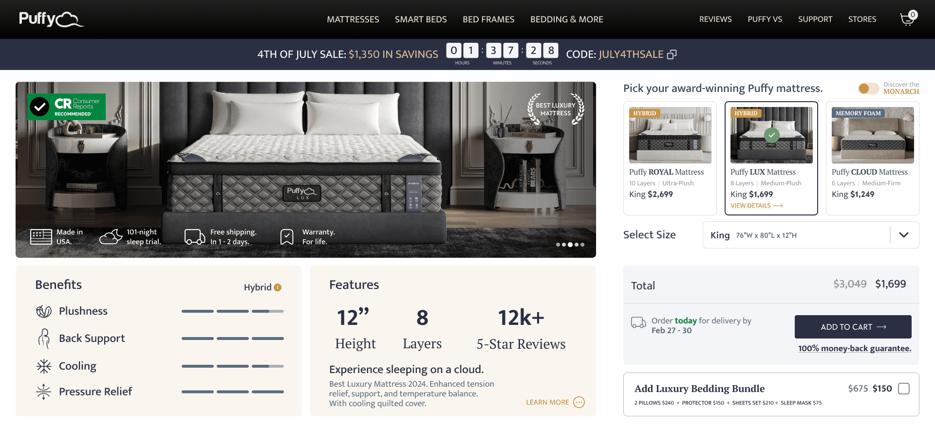
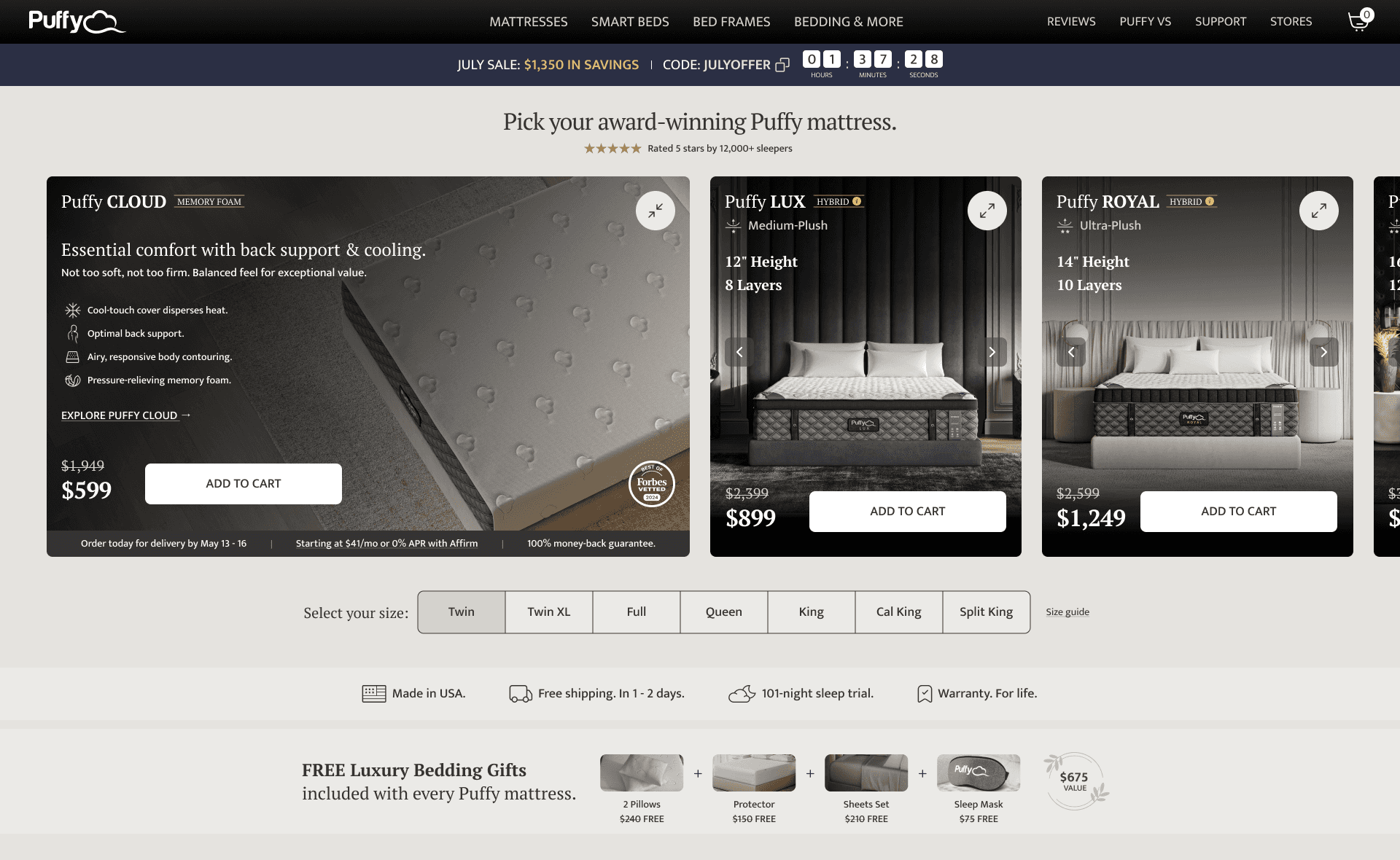
Our product comparison page displayed only three mattresses, hiding the premium Monarch mattress behind a toggle. This design limited our most premium product visibility.
Previous design - desktop screenshot
Key Issues Identified:
Low Visibility of Monarch Mattress: Only 4% of users clicked to view it.
Ineffective Comparison Usage: Despite having a comparison page meant to simplify product selection, heatmaps revealed that users frequently clicked on the "Mattresses" navigation link
Implications:
Difficulty in comparing all products
Limited exposure of most premium products
Inadequate presentation of luxury
By redesigning the comparison page to display all products in a larger, full-screen format with premium imagery, we will:
Enhance Product Visibility and Perceived Value
Simplify the Comparison Process
Facilitate Immediate Actions
Drive Higher Conversions
Goals:
Showcase All Products: Increase visibility by prominently displaying all four mattresses.
Streamline Purchase Path: Improve Add to Cart rates with immediate CTAs.
Simplify Decision-Making: Make price and size comparisons easier and quicker.
Elevate Luxury Perception: Use premium imagery to reflect the high-end nature of our products.
Boost Conversions and Revenue: Achieve measurable improvements in key performance metrics.
1. Design Process
Research & Insights
Using FullStory, I analyzed user journeys and heatmaps, revealing a significant drop-off and navigation behavior that suggested poor visibility of the premium product.
Concept & Ideation
I proposed a redesign to showcase all four mattresses on the MP page without toggles, making comparisons easier and more intuitive.
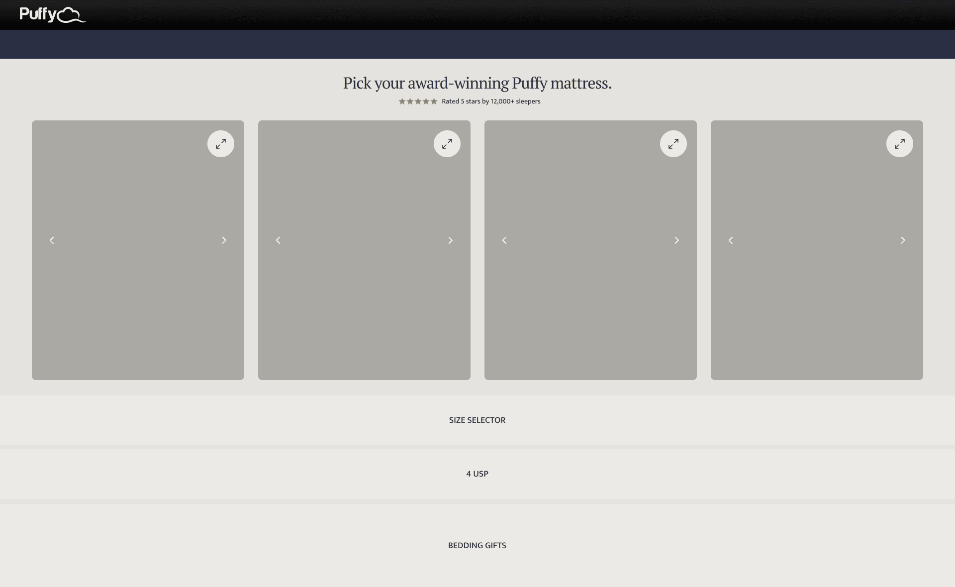

Prototyping & Iterations
I created mid-fidelity desktop wireframes and low-fidelity mobile wireframes in Figma. Collaborating closely with the CRO and Content teams, we refined the design through workshops, addressing content and conversion optimization considerations.
2. User Testing
To ensure the redesigned comparison page met user needs, we conducted comprehensive user testing for both desktop and mobile experiences.
Desktop UT:
Participants: 10 users (60% female, 40% male), aged 32-58, across various desktop devices.
Versions Tested:
Control: Original design with three mattresses and the Monarch hidden behind a toggle.
Variant: Redesigned page displaying all four mattresses with different layout.
Results:
70% preferred Variant for its modern and intuitive layout.
Key User Preferences for Variant:
Easier to compare options
Better understanding of features
Increased purchase confidence
Mobile UT:
Participants: 10 users (70% female, 30% male), aged 32-64, all on iOS devices.
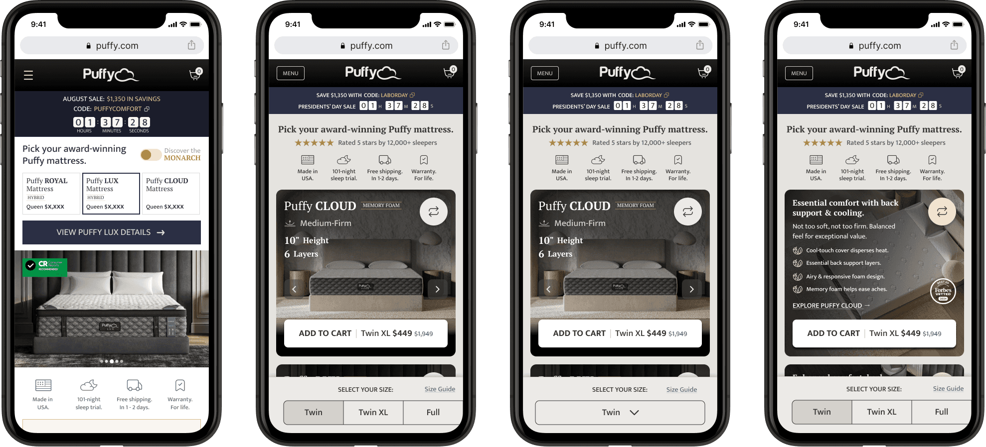
Results:
70% preferred Control for clearer information visibility and easier comparison.
Key points for Variant:
Required more exploration to find information
Users found it challenging to navigate because the two main CTAs (size selector and main Add to Cart button) were disconnected, leading to a disjointed experience.
Modern aesthetics
Mobile user testing results highlighted some challenges, leading to design changes to address user concerns and improve the experience.
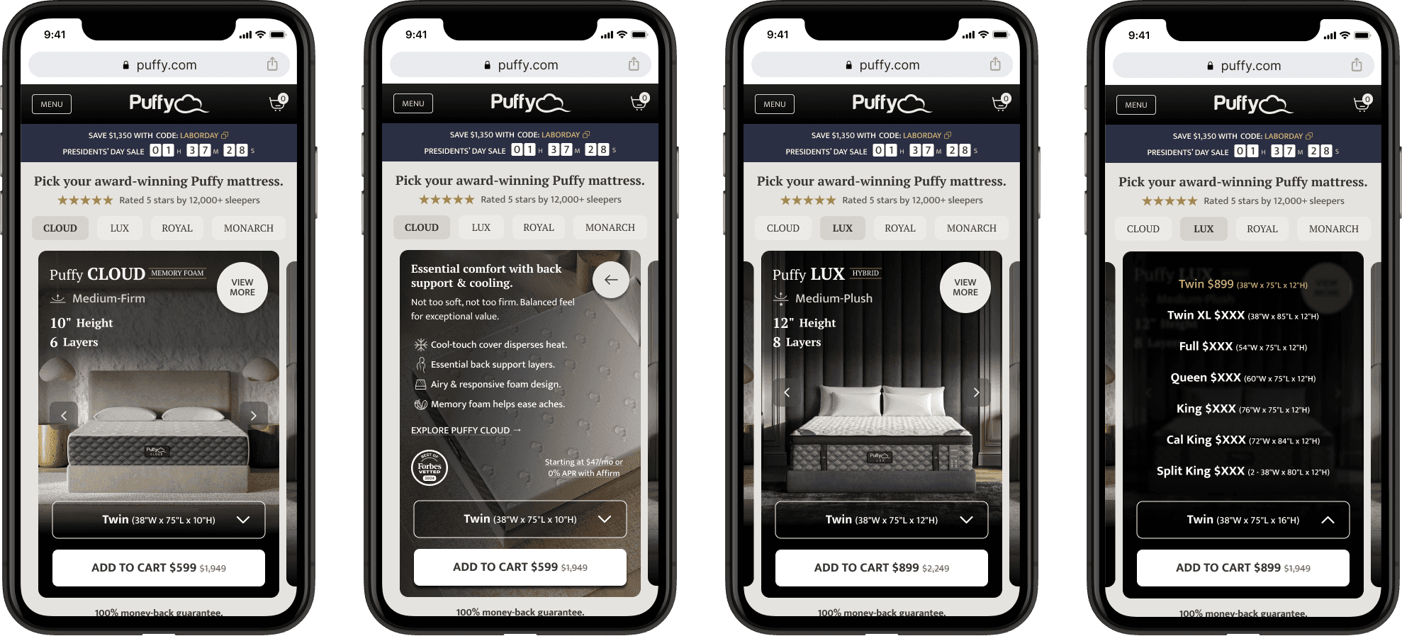
I addressed the issue of disconnected CTAs by placing the size selector and main Add to Cart button next to each other on the cards. Additionally, we increased the size of the cards and made them swipeable for easier interaction. To further enhance user navigation, I added a short tab displaying all four products.
3. Final Design
User testing provided valuable insights, confirming my hypothesis on the effectiveness of a modern, visually appealing layout. Mobile feedback was particularly helpful, and after implementing the necessary changes, I was confident in launching the A/B test with refined designs.
The final design prominently displayed all four products, with enhanced interactions such as card flips for more information and clear Add to Cart buttons. The redesign focused on simplifying comparisons, reducing unnecessary navigation, and creating a seamless user experience.
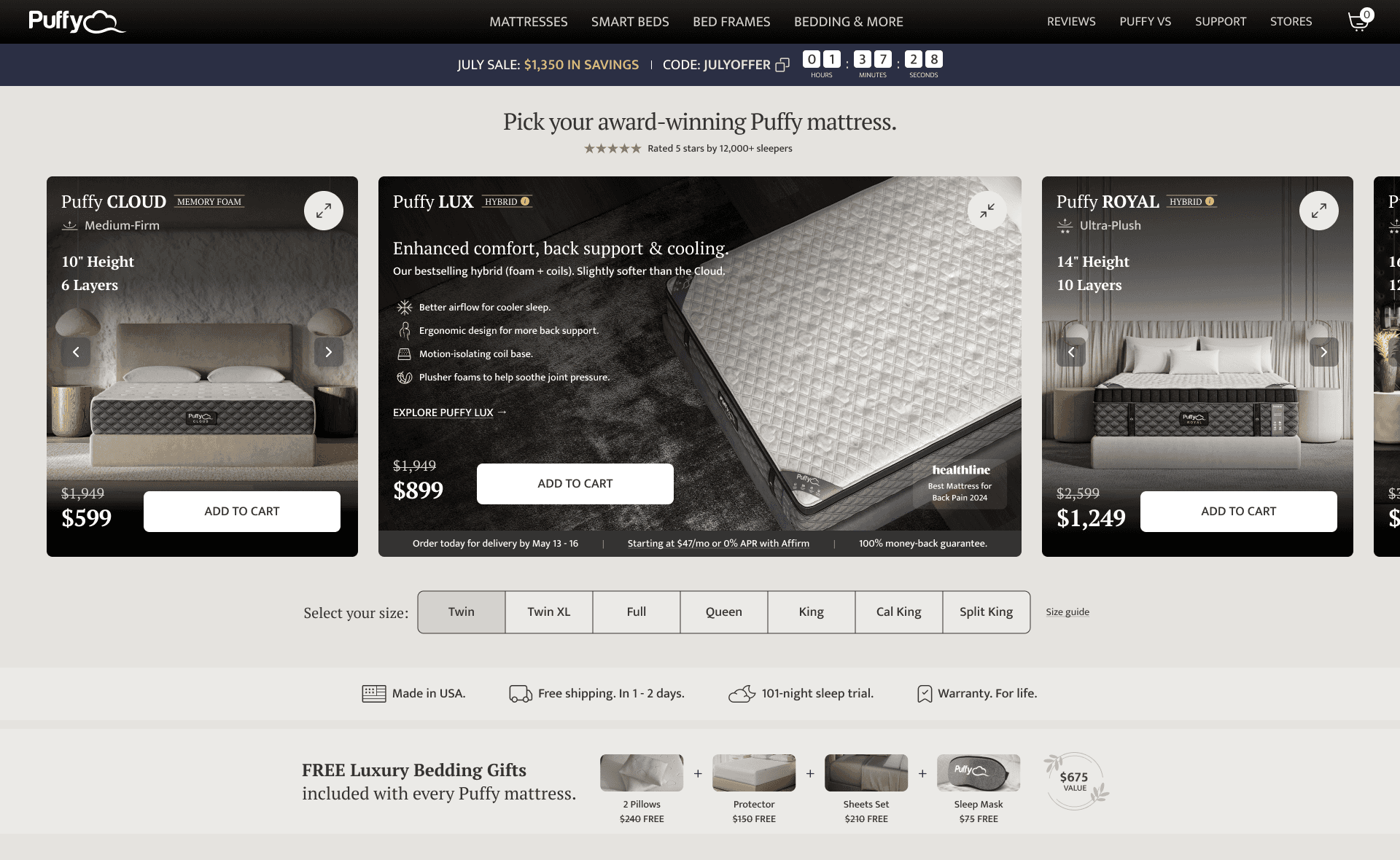
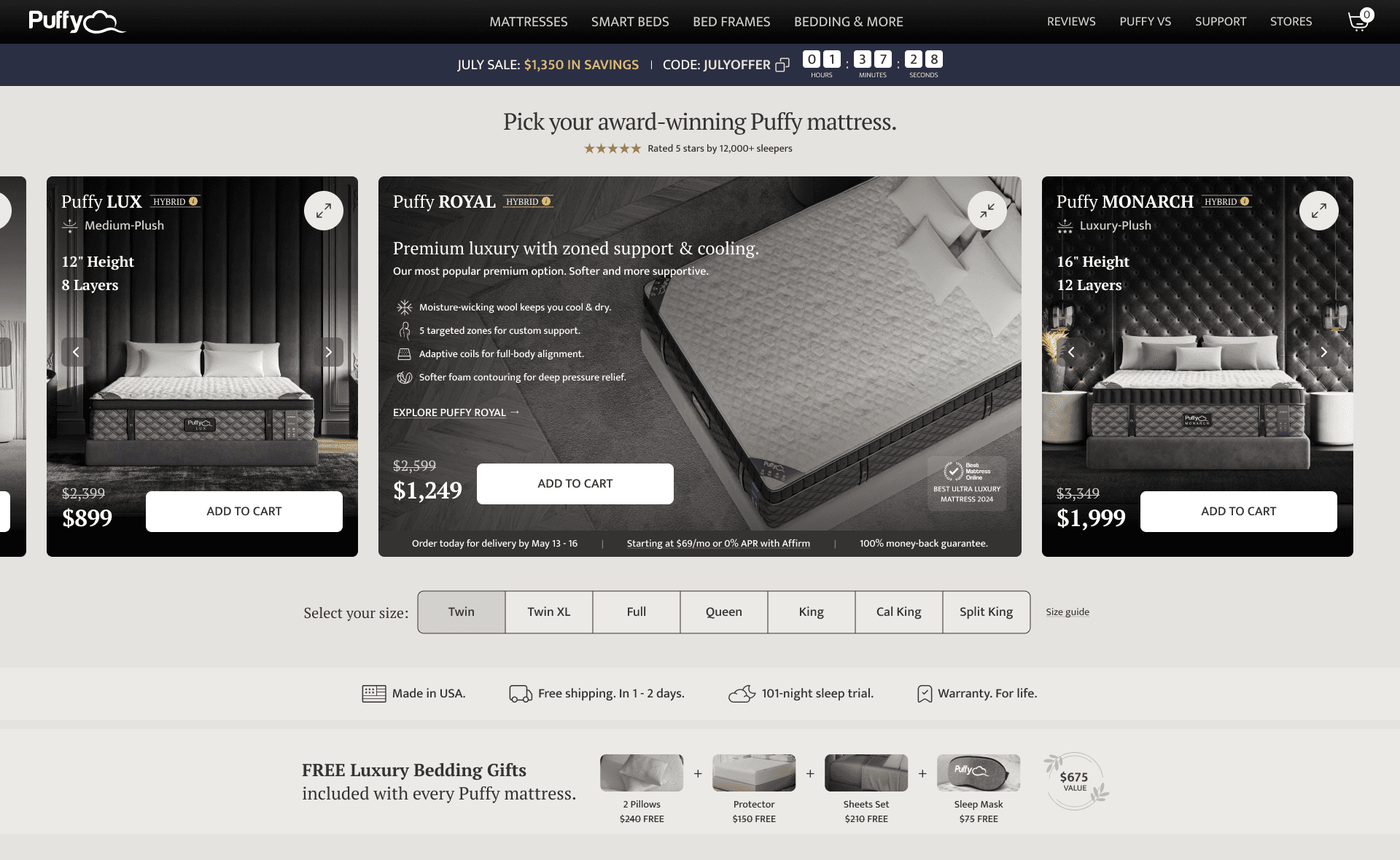
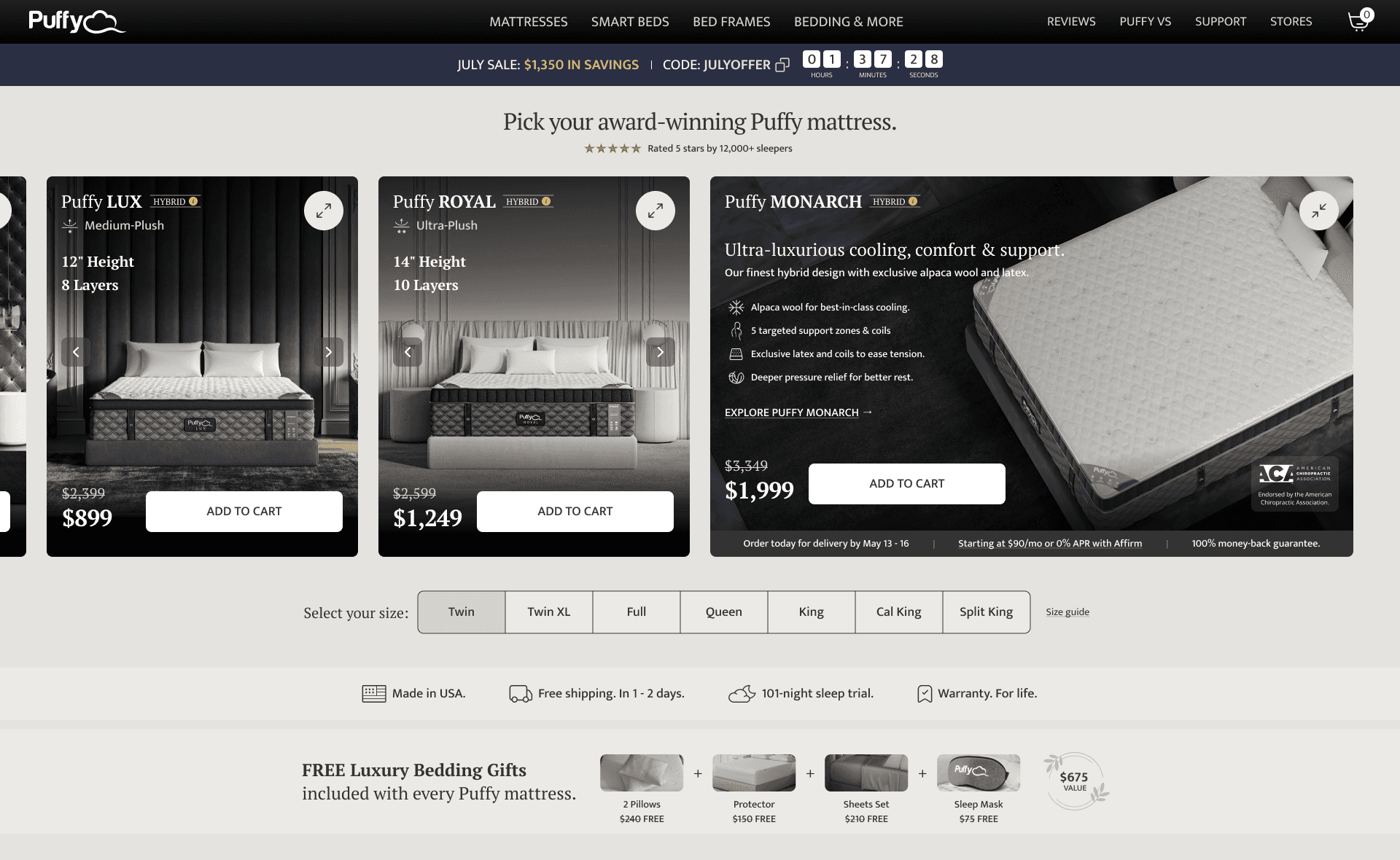
The final design prominently displayed all four products, with enhanced interactions such as card flips for more information and clear Add to Cart buttons. The redesign focused on simplifying comparisons, reducing unnecessary navigation, and creating a seamless user experience.
4. Results
Reflections & Next Steps
The redesign delivered a strong improvement in desktop engagement and conversions, while highlighting opportunities for further mobile optimizations. Moving forward, we aim to refine the mobile experience based on A/B test results.
5. Conclusion & Impact
This project was a transformative journey that showcased the profound impact of user-centered design. By taking ownership from concept to execution, I didn't just redesign a page, I helped reimagine the user experience at a critical touchpoint in the customer journey.
By collaborating closely with the CRO, Content, and Development teams, we ensured that every aspect of the redesign aligned with both user needs and business goals. This project not only delivered a winning A/B test but also set a new standard for future initiatives at Puffy.com.
What's next?
Discover MyHouz Project

VIEW STUDY
Enhancing the Order to Activation Journey:
Check out how I improved the Order to Activation journey, diving into customer experiences.


VIEW STUDY
2024 Dejan Velimirovic. All right reserved.